01
Case Study
Design System Rebuild
The design system existed. Nobody trusted it.
- Detach rate: 40% → 0.3% — verified April 2026, 90-day window across 8 teams. Not self-reported.
- Component insertions: 7,000 → 61,000+ per quarter. Adoption across 6 products, 11 teams.
- 791 tokens in a 3-layer architecture. 94,000+ in production. AA+ contrast, Section 508 alignment built in.
The Problem
What I walked into.
The design system was a collection of disconnected files. I audited the library and found 100+ components that had drifted from engineering implementation. No token layer existed. Dark mode was handled per-product with hardcoded values. Federal accessibility audits — required for Section 508 compliance and VPAT maintenance — produced inconsistent results because there was no shared standard.
Designers detached components to customize them at a 40% rate. That meant every product was slowly becoming its own system. Engineering built the same UI twice because the design source did not match production. The estimated contract exposure: $60M–$140M based on public revenue disclosures.
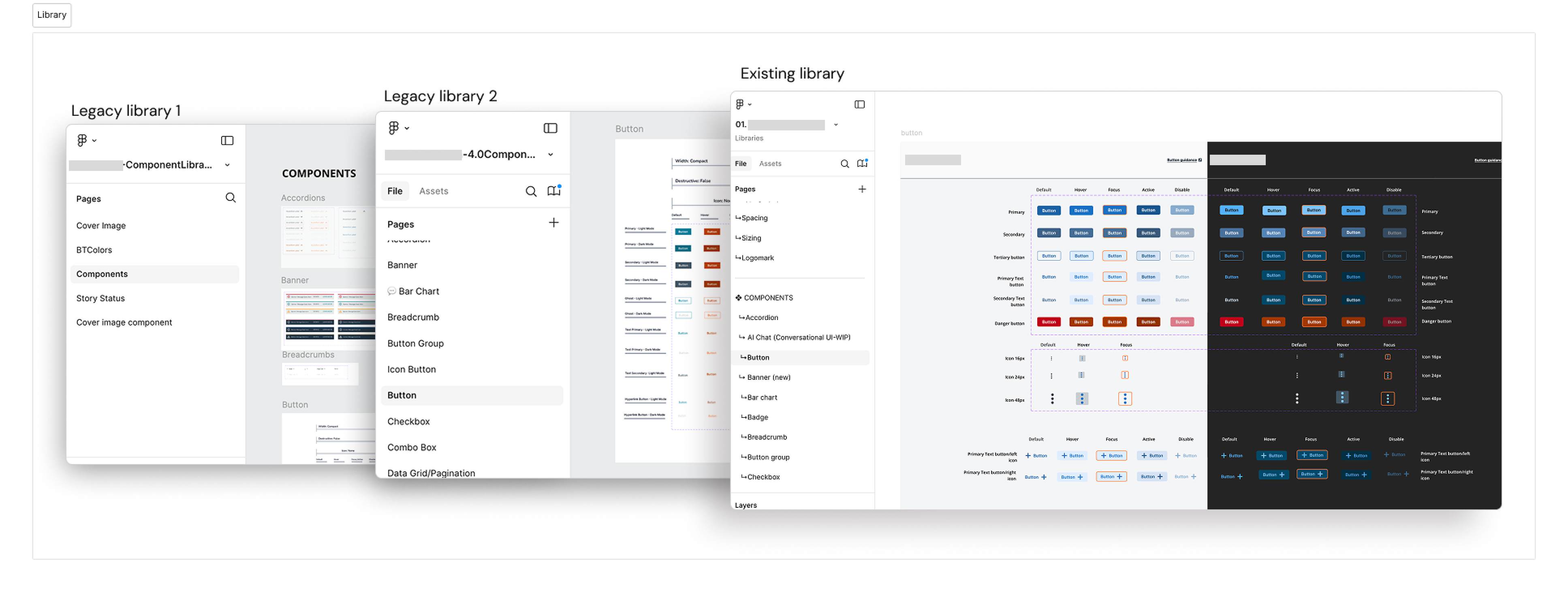
// Legacy Library 1 → Legacy Library 2 → unified existing library
What I Owned
From audit to governance.
I owned the audit and component rebuild, the three-layer token architecture, accessibility implementation, documentation migration, and adoption measurement. I owned the governance model from day one and still do. That includes defining which tokens apply where, auditing usage across teams, maintaining the system post-release, and educating designers and engineers on how to build with it correctly. Post-release, I extended the system's role into AI-assisted workflows, adding another layer of structure to how the system gets used.
Decisions I Made
Three decisions that held.
01
Three-layer token architecture
Six products running on different frontend frameworks needed an abstraction layer between raw values and component-level usage. I chose a naming convention that gave engineering unambiguous references: {category}.{role}.{state}.{mode}. Primitive → Semantic → Component, with 791 variables. Theme generation for light and dark is automated.
Effect: Dark mode stopped being a per-product engineering problem. Global visual updates propagate everywhere automatically.
02
Governance model with a formal entry gate
Without it, teams duplicated components under different names. A "Tiles vs Cards" conflict was the clearest example. I resolved it by defining Tiles as navigation triggers and Cards as content containers, which also clarified accessibility focus state requirements across five products.
Effect: Detach rate dropped from 40% to 0.3%. The governance structure is what held the adoption — not just the quality of the components.
03
Documentation migration
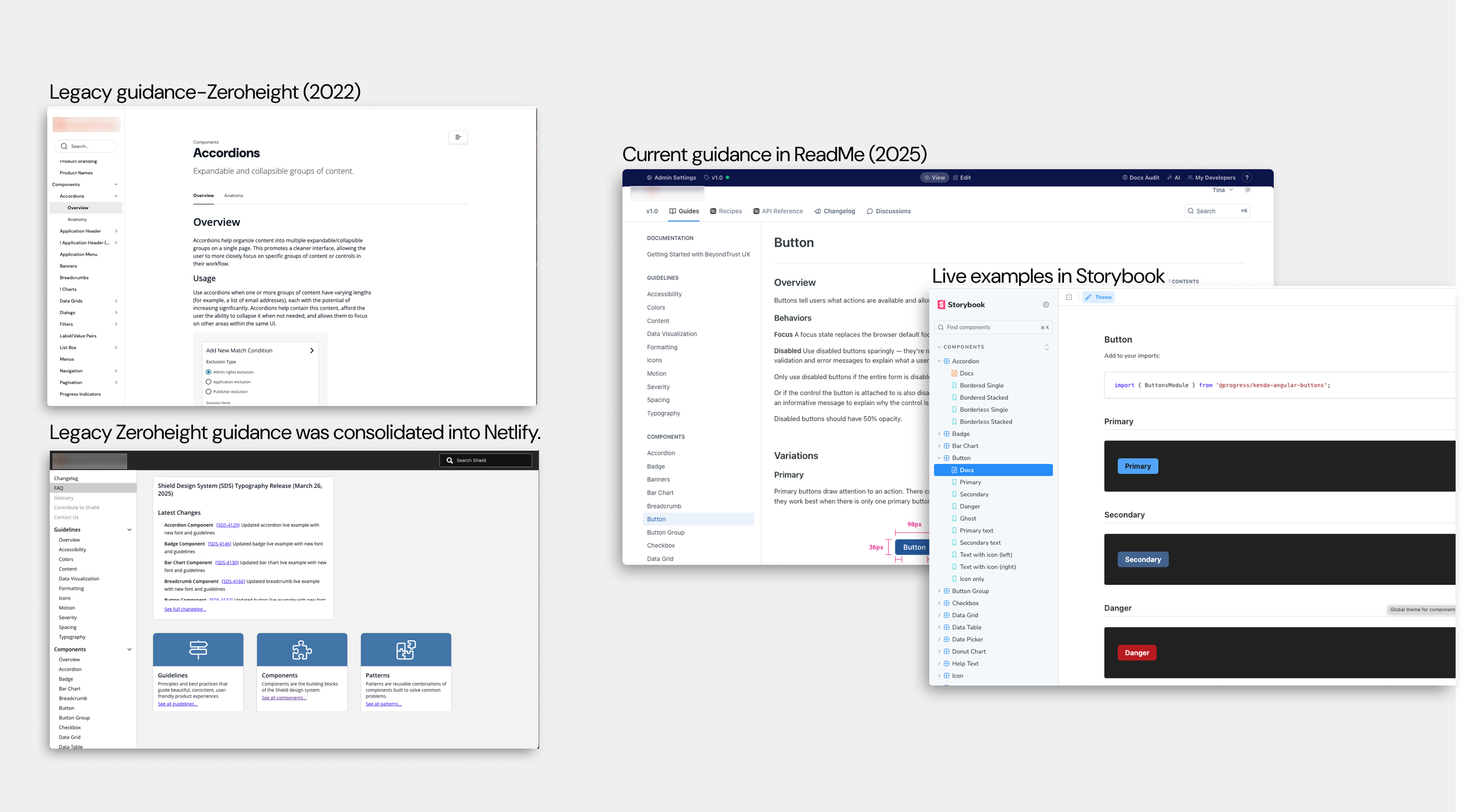
The previous documentation tool treated docs as a separate artifact from code. I moved usage guidance, token references, and code demos into a unified framework so designers and engineers read the same source of truth. Documentation became versioned alongside the component code.
Effect: Eliminated the Slack-based documentation pattern. New team members onboard to the system without a handholding session. Design reviews shortened because the system enforces consistency before the review happens.
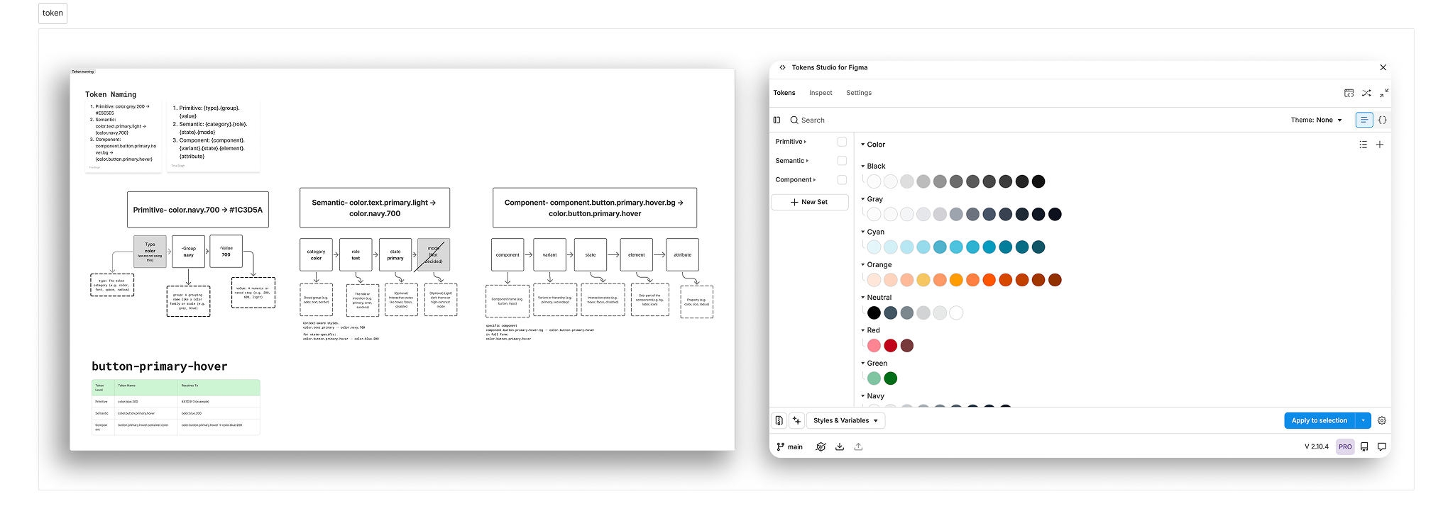
// Token Studio — Primitive, Semantic, and Component token layers in Figma
// Color token layers: Core → Semantic → Component
Constraints
What I was working around.
01
Legacy frameworks
Two products ran older UI kits that could not consume tokens natively. I created migration guides mapping hardcoded values to semantic tokens, making adoption low-effort rather than a rewrite.
02
No dedicated frontend engineer
I scoped component specs to minimize ambiguity. Figma component properties mapped 1:1 to code props so implementation required minimal back-and-forth.
03
Federal compliance pressure
The company maintains 16 VPATs for government procurement. Accessibility failures can disqualify the company from contracts worth an estimated $60M–$140M. Compliance had to be structural — built into the token layer, not enforced manually per product.
What Shipped
The system in production.
✓
Visual modernization with AA+ contrast across light and dark modes. Version-controlled releases with change logs. Component lifecycle management.
✓
Analytics dashboards tracking insertions, detaches, and usage patterns per team. Adoption across all 11 teams.
✓
94,000+ tokens in production. Light and dark modes. AA+ contrast. Section 508 alignment. The system is measurable, observable, and still active.
Measurement
Not self-reported.
I stopped trusting self-reported adoption and built the pipeline that replaces it. A Claude Code skill (/figmascan) runs on the 1st and 16th of every month via launchd, walks the full Figma node tree across all product teams, pulls the Library Analytics API, and generates a dashboard. Fully unattended.
Latest scan — April 16, 2026:
→
369 files scanned. 116 contain SDS components — 31% file coverage.
→
4% instance coverage across 3.4M nodes. This is the honest number. Legacy screens and unmigrated work still dominate the tree.
→
0.3% detach rate across 8 teams over 90 days. Component quality is holding.
→
The most active team logged 9,205 insertions in 90 days. One team came in near-zero and got flagged for a follow-up conversation.
→
5M+ token drift nodes and 29 local workarounds identified as the next remediation target.
The gap between high team-level adoption and 4% instance coverage is the real story. Teams use the system where it fits. Everywhere else is work that hasn't been migrated yet. Having the number makes the roadmap defensible instead of aspirational.
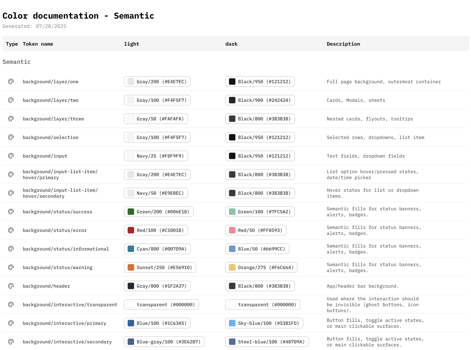
// Usage guidance — component documentation and adoption patterns across teams
Open to senior IC roles in design systems and principal designer positions. If this work is relevant to a role you're hiring for —
Get in Touch →
What I Still Question
Adoption metrics confirm teams use the system. They do not confirm teams understand it well enough to extend it correctly without me. The gap between usage and genuine shared ownership is unsolved.
The measurement pipeline answers how much but not how well. A team can insert 9,000 components and still misuse half of them. That's the next layer of the problem and I don't have clean instrumentation for it yet.
Why This Mattered
Revenue protection. Not design preference.
01
Revenue protection
The company sells to US federal agencies under contracts that require Section 508 compliance and VPAT maintenance. Stale accessibility documentation and inconsistent UI across products create disqualification risk during procurement reviews. The estimated contract exposure is $60M–$140M based on public revenue disclosures. A governed, accessible design system is not a design preference. It is procurement infrastructure.
02
Engineering time recovered
Before the rebuild, designers detached components at a 40% rate. Every detach means engineering builds custom UI instead of using the system. At scale across 11 teams and 6 products, that is hundreds of hours per quarter spent rebuilding what should already exist. Reducing detach to under 1% returned that time to feature work.
03
Faster delivery and reduced onboarding cost
New product surfaces that previously required weeks of custom component work now ship using system components. Design reviews shortened because the system enforces consistency before the review happens. New designers inherit a governed system with versioned docs instead of tribal knowledge. Ramp-up shortened across all 11 teams.
This case study connects to the Inline Alert (feedback taxonomy, cross-team adoption) and Token Architecture (three-layer model, naming conventions, export pipeline) work documented separately.