03
Case Study
Platform Navigation
Four acquisitions, four navigation systems. Users felt like they were changing apps every time they switched tools.
- 40% navigation redundancy eliminated — restructured into a Hub & Spoke IA model with a global bar + contextual side rail
- 1,000+ deep-link routes unified through a single JSON payload — no per-product rewrites, 100% adoption in 4 months
- 22% faster cross-product workflows — Behavioral matrix (active states, tenant switching, breadcrumb logic) delivered as engineering handoff, not just Figma
The Problem
Navigation as a bottleneck.
By the time the platform had six products, navigation was slowing down work instead of enabling it. Behavior changed between products. Users lost their place. Developers maintained separate codebases for the same UI because there was no shared version to point to. Each new product integration meant rebuilding navigation from scratch.
The problem was architectural, not visual. No shared logic for states like pin/unpin, no persistence model, no defined behavior for hierarchy and tenant switching. What looked like a styling problem was actually undefined behavior.
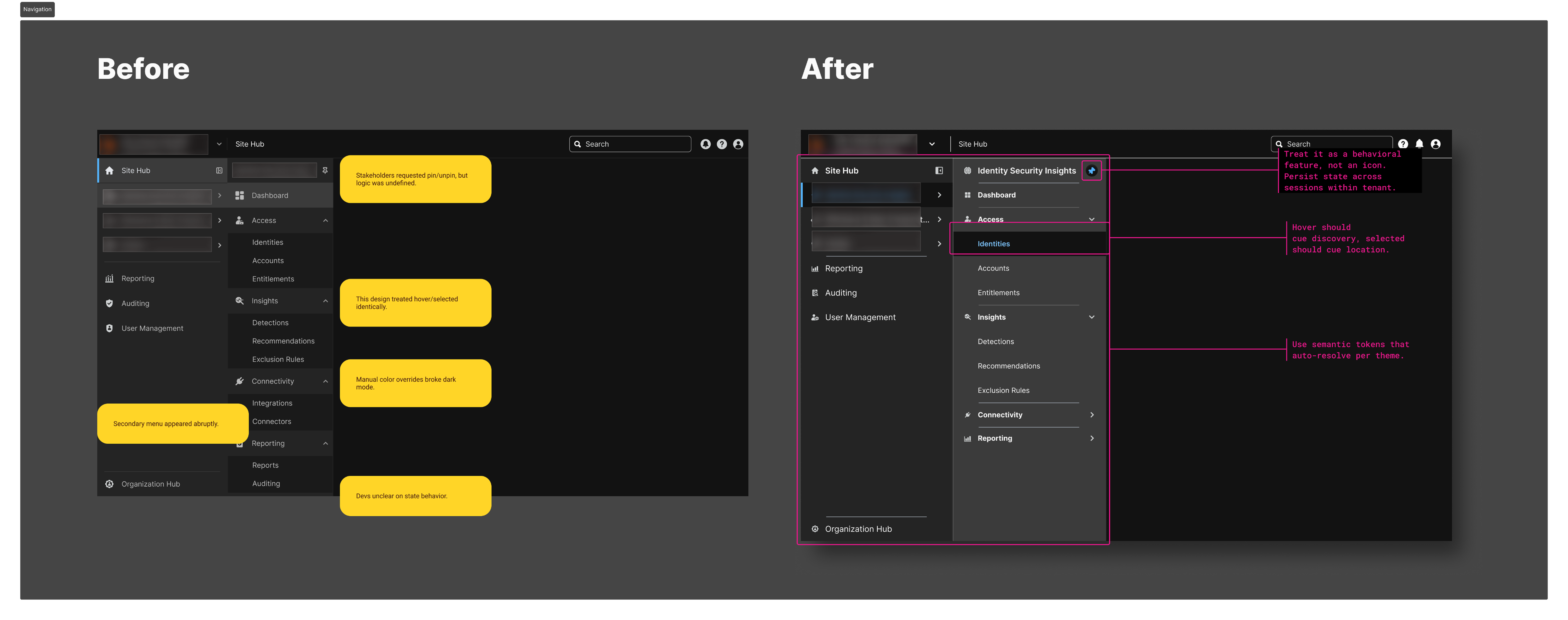
// Before: fragmented, annotated with issues. After: unified hub-and-spoke
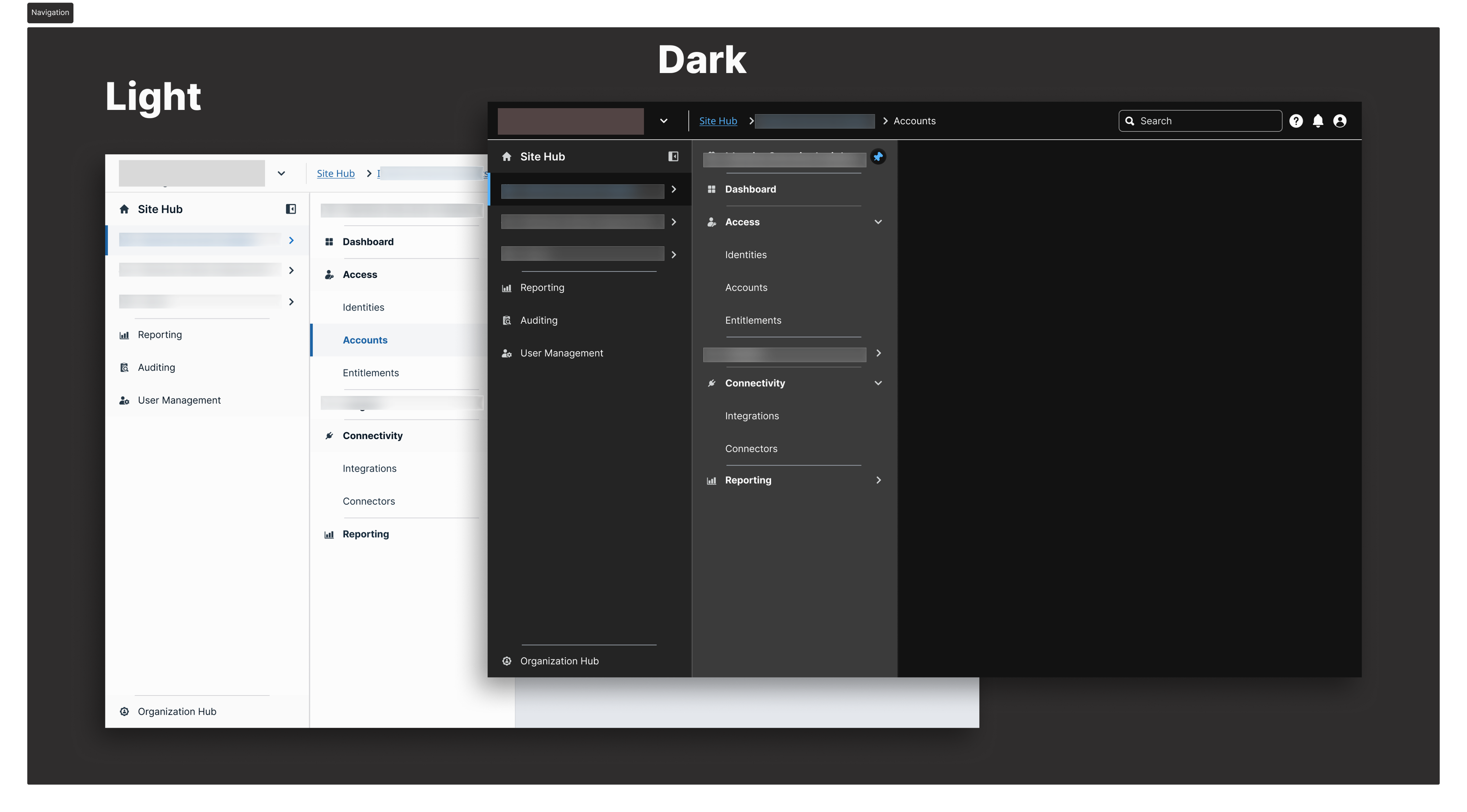
// Light and dark mode — same structure, same tokens, no manual overrides
What I Changed
State maps before mockups.
01
Wrote the behavioral specification before opening Figma
Documented every navigation state, every transition rule, every edge case: hover delays for fly-outs, active state persistence three levels deep, breadcrumb logic after a deep link, what happens when a session expires mid-navigation.
Effect: Engineering had answers before implementation started. The spec eliminated the back-and-forth QA cycle that had added weeks to previous releases. The UXA team built a working proof of concept the day after receiving the state map.
02
Proposed and designed a Hub and Spoke IA model
Separated global navigation (persistent across all products — product switcher, search, profile, notifications) from contextual navigation (side rail, purpose-built per product suite).
Effect: Users got a stable "where am I?" anchor in the global bar that never changed, regardless of which product they were in. Product-specific navigation got shorter and more focused.
03
Replaced search-based tenant switching with a dropdown
Initial design used a search field for tenant selection. In usability testing, users didn't know what to search for — the input required knowledge they didn't have (exact tenant names).
Effect: A pre-populated dropdown of authorised tenants resolved the most-reported tenant switching confusion pattern. Users could see their options instead of having to recall them. Support tickets referencing tenant switching dropped after rollout.
04
Built three fully interactive pin/unpin prototypes
Solid pin, outline pin with accent ring, and a motion-based dynamic indicator — each fully interactive and token-linked — before settling on the final model.
Effect: Stakeholders reacted to real behavior, not a description of behavior. The final decision was made in one review session instead of iterating through written feedback cycles.
05
Defined a single JSON routing payload for all 6 products
One structured data file governing the navigation tree, permission levels per item, active state logic, and deep link mappings — agreed on with engineering before any Figma frames were built.
Effect: 1,000+ previously hardcoded, per-product deep-link routes unified. Adding a new product or updating a navigation item now requires a change in one place.
06
Designed a Slim/Expanded rail toggle with session persistence
Icon-only Slim state (56px) for power users in dense environments. Labeled Expanded state for orientation and discovery. Preference persisted to localStorage.
Effect: Security operations center users on wide monitors reclaimed horizontal content space without losing spatial awareness. The preference follows users across sessions without any backend changes.
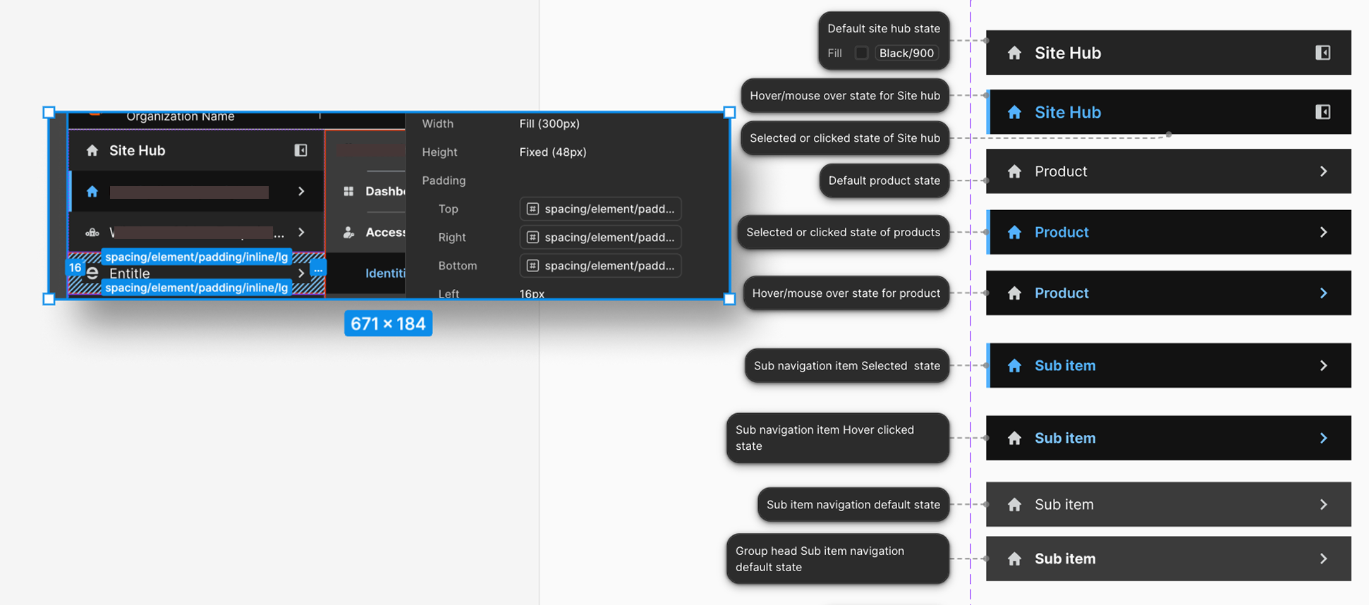
// Component specs: states, spacing, token references, and interaction annotations
Business Outcomes
40% navigation redundancy eliminated.
↓
40% navigation redundancy eliminated. "Reports," "Analytics," and "Audit Logs" pointing to the same destination across three products — consolidated and labelled consistently. Menus got shorter. Paths got clearer.
✓
1,000+ routes unified under one JSON file. Engineering stopped maintaining six separate routing tables. The ongoing maintenance burden that had been generating debt with every product integration was resolved structurally.
↑
22% faster cross-product workflows. Measured after rollout. The behavioral spec meant engineers implemented correctly on the first pass — no post-launch patching of undefined states.
✓
100% adoption across 6 products in 4 months. The Hub & Spoke model and JSON payload were adopted by every product team without exception.
→
Behavioral spec became the platform standard. The logic and documentation format introduced in this project became the template for how future platform components are specified.
Reflection
"Navigation design is information architecture, not visual design. The visual execution took a fraction of the time once the structure was right. The work that mattered was the audit, the matrix, and the specification — the unglamorous foundation that let everything else ship cleanly."